Colour and its' ability to create mood in multiple dimensions is a topic that has holds great power in the design industry as a whole.
Colour has always been an interesting topic in the world of design. Not only does it allow designers, interior designers and architects to create an environment based around a specific aesthetic, but it also entices a sense of mood.
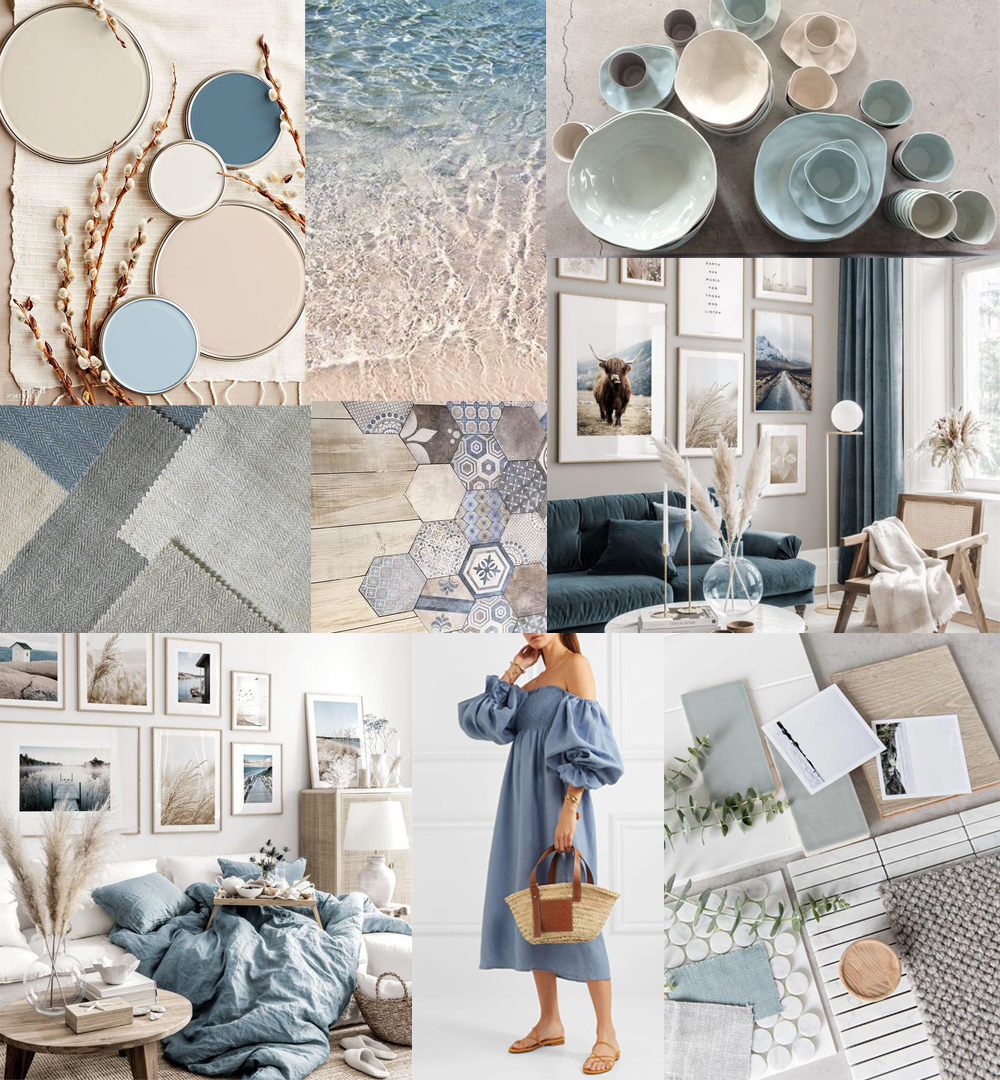
BLUE
Also known as the intellectual colour, is the colour of the mind and is essentially soothing; it affects us mentally, rather than the physical reaction we have to red. Strong blues will stimulate clear thought and lighter, soft blues will calm the mind and aid concentration. Consequently it is serene and mentally calming. It is the colour of clear communication. Blue objects do not appear to be as close to us as red ones. Time and again in research, blue is the world's favourite colour. However, it can be perceived as cold, unemotional and unfriendly.
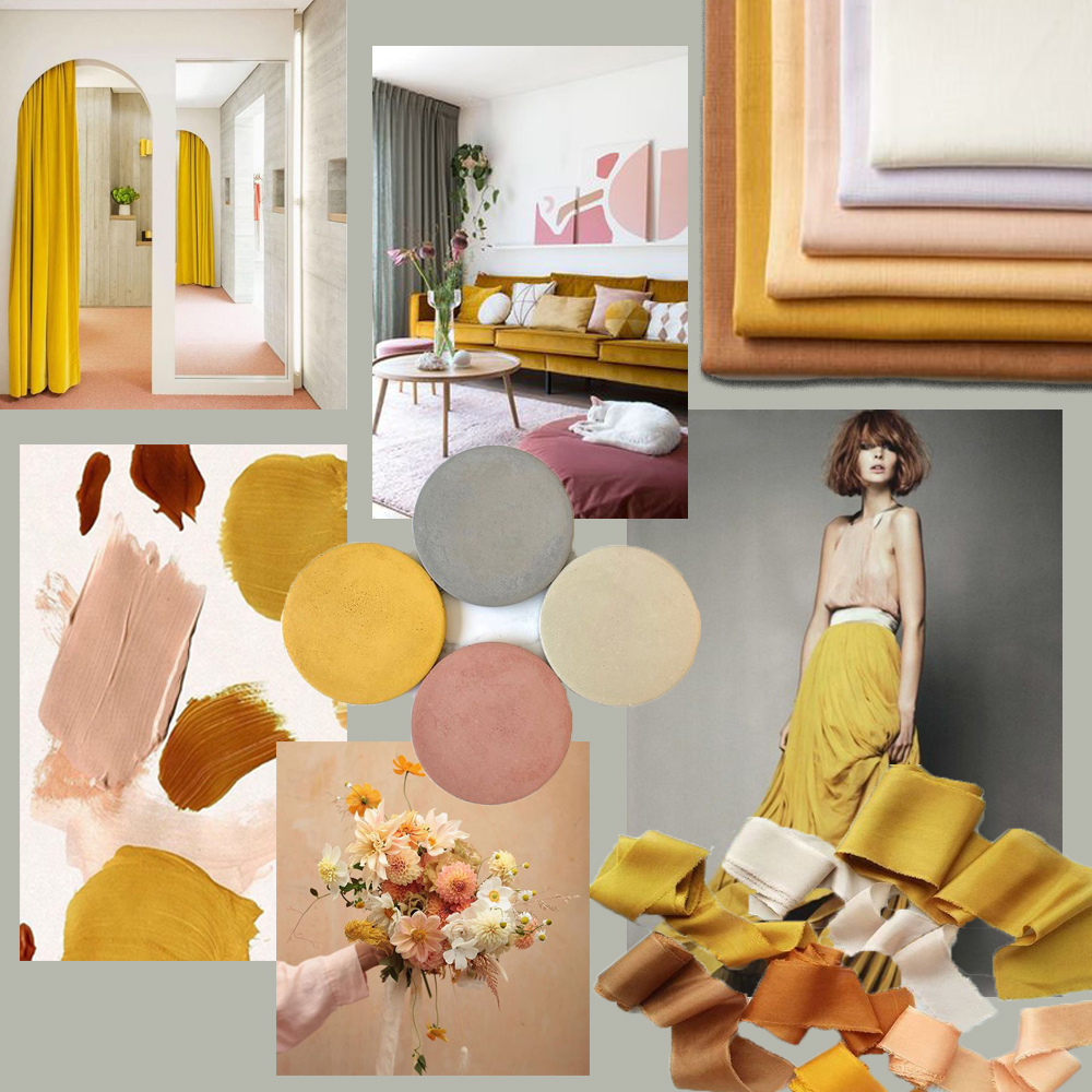
YELLOW
The yellow wavelength is relatively long and essentially stimulating. In this case the stimulus is emotional, therefore yellow is the strongest colour, psychologically. The right tone of yellow will lift our spirits and our self-esteem; it is the colour of confidence and optimism. Howvever, caution must be taken when including yellow as a major them of your overall colour palette as too much of it, or the wrong yellow tone in relation to the other tones in a colour scheme, can cause entice an adverse affect. Our "yellow streak" can surface. Yellow, in various forms and tones also remains a staple colour year-on-year in trend forecating analysis given its ability to adapt and blend well with so many other colours. Yellow is also seen a safe gender neutral colour choice and is often a favourite for many baby rooms when the gender is unknown.
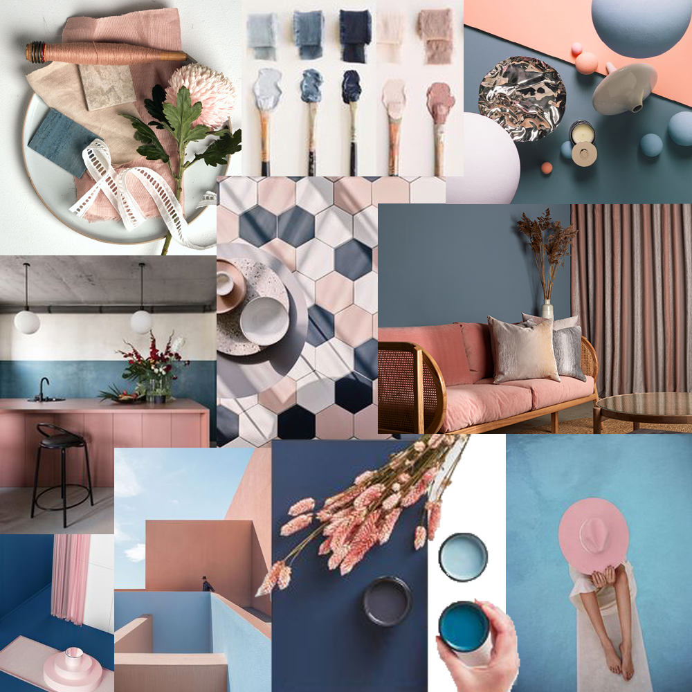
PINK
Being a tint of red, pink also affects us physically, but it soothes, rather than stimulates. (Interestingly, red is the only colour that has an entirely separate name for its tints. Tints of blue, green, yellow, etc. are simply called light blue, light greenetc.) Pink is a powerful colour, psychologically. It represents the feminine principle, and survival of the species; it is nurturing and physically soothing. Tradition has always said that too much pink is physically draining and can be somewhat emasculating, however, with the movement of trends, time and bias, pink has moved into a new light and is becoming more of a featured fanshion statement in a males wardrobe. One of the many things that proves pinks diversability and ability to adapt and appeal to ever changing trends.
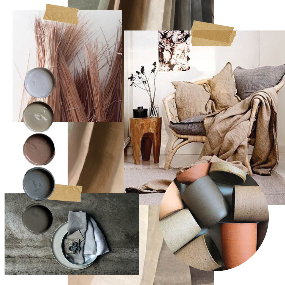
BROWN
Brown usually consists of red and yellow, with a large percentage of black. Consequently, it has much of the same seriousness as black, but is warmer and softer. Brown has associations with the earth and the natural world. It is a solid, reliable colour and most people find it quietly supportive in a fairly neurotic colour pallet - more positively than the ever-popular black, which is seen as being suppressive, rather than supportive.
Colour plays an import role in how we feel and act on a daily basis, and while it is important to pick based on preference it is important to consider this aspect when designing or deciding to design in our home envrionment. We cannot control what colour we feel when we leave our homes so it is vital to ensure your home colour palette is filled with the colours that will refresh you at night and awaken you during the day, giving you the best opportunity to start your and end your day the right way.
For all things colour, design and mood, head to one of our Instagram pages; @sekers_fabric, @maurice_Kain or @zaabhomwares for daily colour-spiration.

