Deep Dive: Pantone Colour of the Year 2024
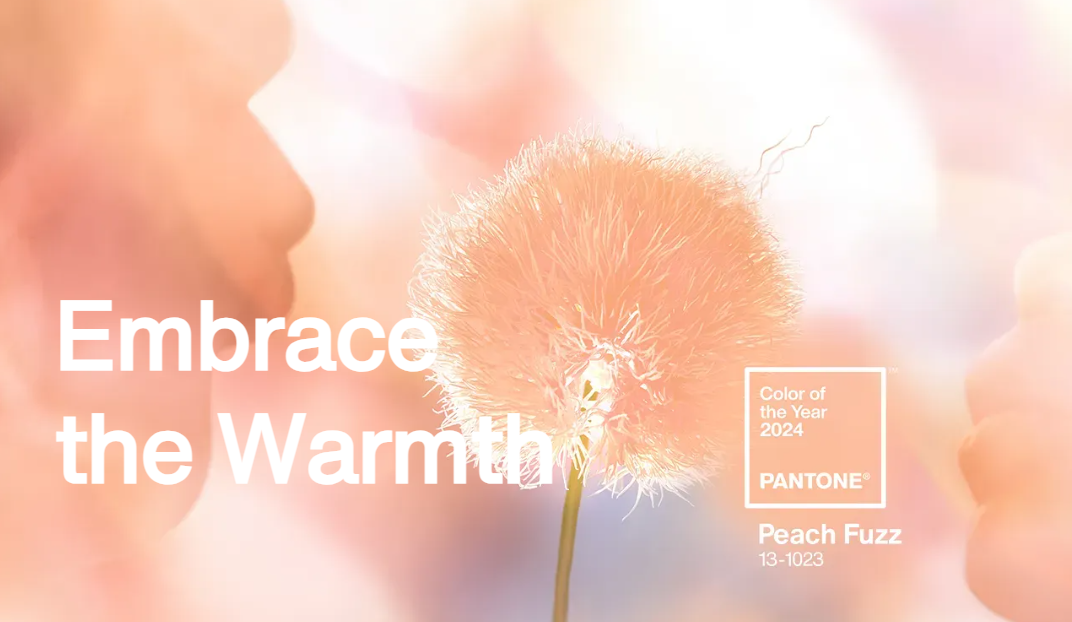
The PANTONE 13-1023 Peach Fuzz captures our desire to nurture ourselves and others. It's a velvety gentle peach tone whose all-embracing spirit enriches mind, body, and soul.

In seeking a hue that echoes our innate yearning for closeness and connection, we chose a color radiant with warmth and modern elegance. A shade that resonates with compassion, offers a tactile embrace, and effortlessly bridges the youthful with the timeless.- Leatrice Eiseman, Executive Director, Pantone Color Institute
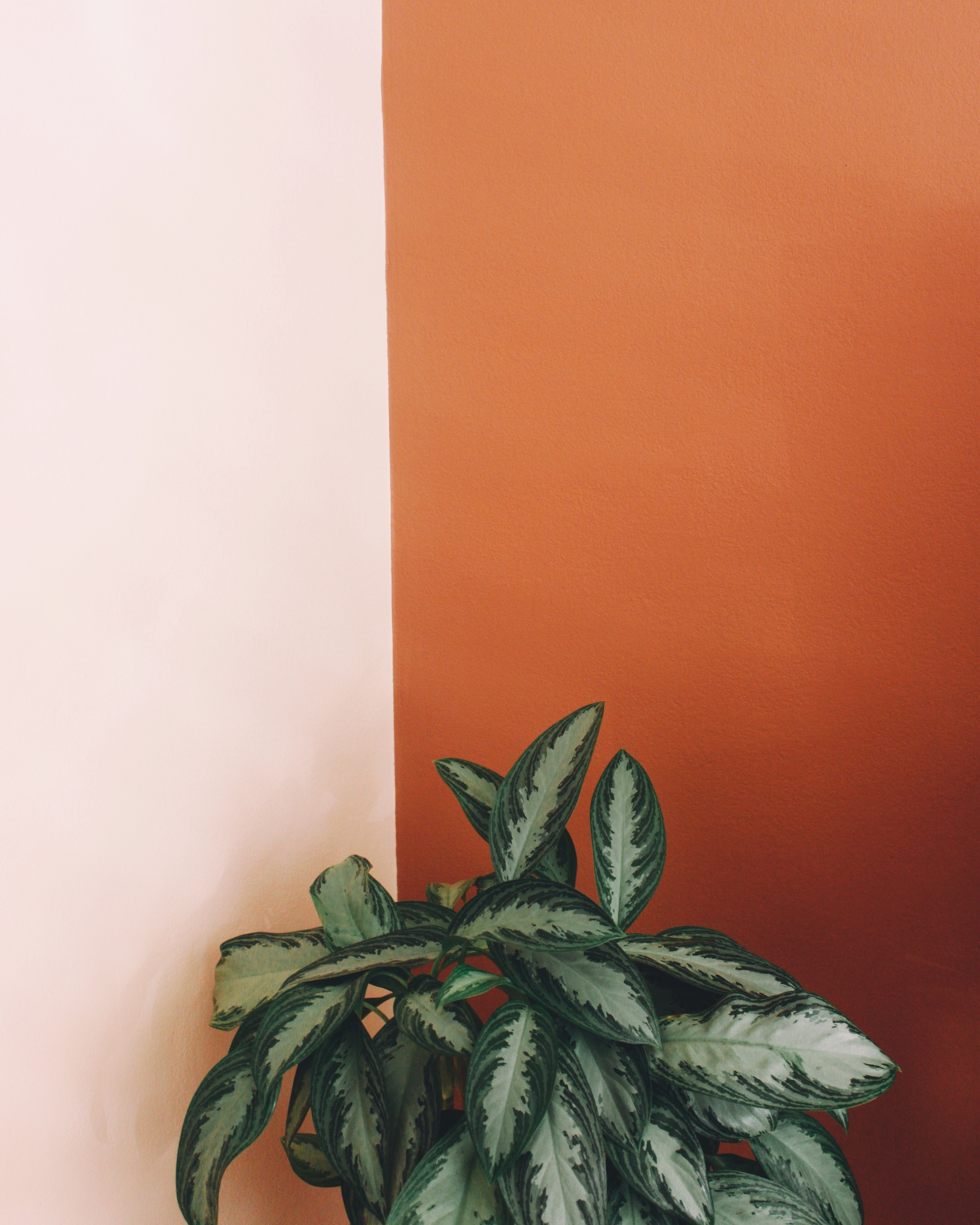
In the world of architecture and interior design, PANTONE 13-1023 Peach Fuzz can create welcoming atmospheres. This peach hue is claimed to nurture a sense of tranquility and provide spaces for relaxation and personal growth. Whether on a painting wall, in home décor, or in furniture, the color brings a gentle warmth to intimate spaces.

This color also marks the 25th year of Pantone Color of the Year. The Pantone Color Institute started the program in 1999 with Cerulean Blue, and it has become an iconic part of world culture since, with millions of people eagerly looking forward to the announcement of the year’s color.
We sat down with our Head of Product Development and asked her what she thinks Peach Fuzz will mean for interior design over the next 12 months? "I am sure Pantone has lots of ideas of how and where this colour can fit into someones home. One could say they always make sure to pick a colour that is 'commercially astute'. I think we will see a lot of fluffy peach duvets, and table lamps along with peach accent walls and throw cushions. This colour does come across as quite jarring and bright, so I think the everyday consumer might be more reserved when it comes to incorporating it in their home." - Maya Vivian, Head of Product Development.

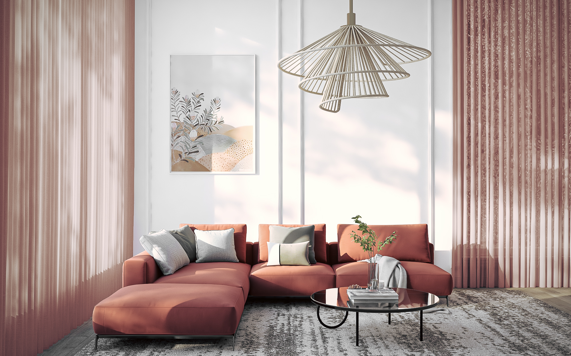
What will this mean for soft furnishings over the next 12 months? "I think we have to try to take these colour trends with a grain of salt and not implement it so literally. I don't think we are going to be seeing bright peach curtains over every window pane across Australasia, but I can see this having an impact on perhaps the tones of pinks, reds and oranges we might lean towards when assessing colour palettes for a collection." - Maya Vivian, Head of Product Development. "We may start to see more baby pink sheers such as our Southport fabric in Blush, or more exotic prints that feature subtle faded reds and dulled orange that give homage to the Peach Fuzz trend."- Maya Vivian, Head of Product Development.


